Feedback gratefully welcomed!
I spent a few hours yesterday playing on paper with some ideas. Having gone through the survey and looked through academic literature on alarm clocks, I've a set of basic requirements. There's nothing particularly earth-shattering here, in fact they're quite dull:
- The product will be an alarm clock application for the iPhone;
- Its primary purpose will be to ensure that owners get up in the mornings, at the time they want to;
- To support this it will help them set their alarm accurately;
- It will also help owners remember to set it in the first place;
- It will allow owners to set a repeating alarm;
- Its secondary purpose will be to assist its owners in ensuring they get into good sleep habits: enough sleep nightly, without needing to catch up at weekends.
I've identified some principles I'd like the product to embody. I'll list these out first, then explain them in more detail with some illustrative sketches:
- "Stroking, not poking";
- Promote mindfulness, rather than dictating;
- Make use of context;
- Presume grogginess;
- Sound is 50% of UI;
I'd love to hear any feedback you have on these, the sketches below or the process; part of the reason I'm posting about this project is to try and replicate the routine of regular presentation and constructive criticism that I've read Pixar have in place. I'm doubly interested if you work day-to-day as a professional designer.
"Stroking, not poking"
Throughout lectures this term, Graham repeatedly brought us back to the idea of emotion in UI, throughout lectures this term, and I have a half-baked theory which relates this to touch user interfaces.
 Nass and Reeves show in The Media Equation that "individuals' interactions with computers, televisions and new media are fundamentally social and natural, just like interactions in real life". The same gestures that we use to talk to our touch-screen devices came from our flea-picking monkey-pasts. It seems reasonable to suggest that gestures which ApeMe associates with positive things, like grooming, will engender a more positive emotional response than gestures which ApeMe associates with negative things: like poking. (How often do you poke those you love in real life?)
This is pop science at its worst, I appreciate, and I've been looking around for papers which might confirm or disprove it, without success (anyone know of any?). But in the absence of evidence, I'm going to go with it anyway and see if it works for me.
What this means is that I want the UI of the clock to use languid, flowing gestures throughout most of its use - and stabbing, pokey gestures in places where either (a) the user is feeling negative towards the clock (like, when waking up and trying to turn it off), or (b) as punctuation at the end of an activity: a kind of gestural full-stop.
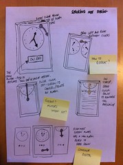
So, the app uses a large clock-face as its primary UI, and a mental model of multiple clocks laid out horizontally to allow for multiple alarms. On starting the app (bottom right), the user is welcomed and asked to drag down a new clock from just off the top of the screen, at which point (top left) they can set an alarm by dragging a finger around the dial. Perhaps the rate of movement of the alarm hand would vary depending on how close to the centre of the dial their finger is - I'd need to play with that. The only poking motion is the button to turn on the alarm: so the setting-ritual is a sequence of sweeps and a final stab.
To move between clocks, the user drags the whole screen left and right (see top right), to get rid of an alarm they flick it up and off-screen, back where it came from (mid left), and to add an alarm they scroll to the right and drag a new clock down (bottom left).
There's a big assumption here: that I will be using an analogue clock face. Every mobile clock I've seen so far uses a digital display, which makes me suspicious there's something I'm missing here. I know that 76% of survey respondents keep their mobile within arms reach or closer at night, and it should be possible to create a display which is visible enough at that distance, but still…
Promote mindfulness, rather than dictating
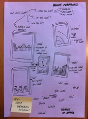
A secondary aim of this project is to make an alarm clock which helps its owner get the right amount of sleep. I've chosen to do this in a quiet fashion: rather than, say, alerting the user when it's time to go to bed (which might play towards the "alarm clock as tyrant" analogy which surfaced in a couple of papers: Wensveen 2000 and Zimmerman 2009), providing a simple, almost-background visualisation of how much sleep they've had, as measured by the difference between the time of going to bed, and the time they get up.
I'm making the assumption I can measure the former through a combination of signals: what time the alarm is set (many being set as part of the bedtime ritual), when ambient light levels change downwards significantly (using an on-phone light sensor), and when the phone is still (using accelerometer). There may be other signals I could use too.
I've looked at a few different ways of showing your recent sleep history: I'm thinking that yesterday, last week, and last month are the time-frames to look at. The first of these will provide most motivation to fix the "just-broken" (i.e. catch up now on last night); the last two give a longer-term perspective. Good habits over a month could imply the user is in a decent routine. Good habits over a week are worth measuring because they'll provide a bridge between short term and long term measurement: they give the clock a way of rewarding its owner for a few good days.
Visualisations could be done lots of ways - from the generated silhouette-landscape of Dream (mid right) and psychedelic Rainbow (top right) to more boring Bar charts (centre) or just sticking the figures on-screen (Say, bottom left). I suspect that I'll end up going with Say or Bar for the purposes of this project: (a) because the end-result of this will be a mid-fi prototype and not much more and (b) because my graphic design skills are ropey if not non-existent.
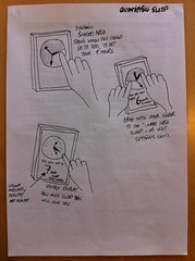 Another point at which it's useful to show how much sleep you'll likely get is during the setting of the alarm. Different people say they need different amounts of sleep (respondents to the survey ranged between 4.5 and 10 hours) too, and having a way to configure this in a direct-manipulation fashion without a settings screen would be nice. I hate settings screens, they're a purgatory for decisions that no-one could make.
So: when setting an alarm, show a shaded area to indicate when you ought to go to bed to get your full 8 hours, or whatever (top left): even if you can't get enough today because you're setting your alarm late at night, it'll provide some impetus to sort things out tomorrow. And to say "I need less sleep than that", let the user use two fingers to drag this window smaller (top right).
Finally, after setting the alarm tell the user how much sleep they're going to get (bottom left). This has a double-function: it's an opportunity to congratulate or criticise a sleeping habit, and double-checks that the user isn't setting their alarm to PM when they meant AM, or vice versa.
Make use of context
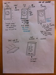 This is a slightly woollier one: I was looking at a few different things here - mainly the Stuff Outside The Phone - and at this point I started playing with faces: clocks have faces, after all, and if we want to build a positive emotional association with a device it's easy to hate, why not make it more human?
So if it's a person not a thing, perhaps he should notice when the lights go out and visibly go to sleep (top right), or smile when you pick him up (top, middle), or be sad when he didn't manage to wake you - perhaps by being totally ignored or snoozed too many times (bottom right)?
Using a gesture to interact with the clock might be useful, particularly when 50% of the use of the clock will be when its owner is in a groggy state, prone and struggling to focus their eyes - so using the device itself to silence or snooze an alarm might be appropriate (bottom right).
I also started playing with a social idea, but I think it might have taken me towards shoehorning too much into the product. If we know when you've gone to bed, we could tell a server (top, middle). And if a server knows when lots of people have gone to sleep, it could tell all those phones (top right), which could start displaying something quiet and ambient about how many other people are sleeping right now. I think these interactions are viable because they happen when the phone is often plugged in or on home wi-fi, and we can usefully ramp down the check-in times to conserve bandwidth and batter (and don't need to check in at all if the display has been off for a while).
Would this provide any social pressure to sleep properly? Kim, Kientz, Patel and Abowd wrote a paper on BuddyClock, an experimental product they had made to share sleep-state with a limited social network and felt that "social influence on another's own behaviour indicates that the BuddyClock could be used as a persuasive technology to help others change their negative sleep patterns".
Presume grogginess
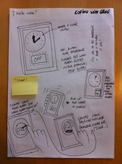
At least half of the time an alarm clock is being used, we know that its owner is confused, prone, and half-asleep; and from the survey I can see that about half of all respondents occasionally forget to set their clock, or mis-set it. What can be done about this?
Obviously the clock face needs to be readable. The button to switch off the alarm should be very visible: in the sketches here, it's also the only button, so there's no choice of where to click. It should (as a friend just pointed out to me in email) always be in the same position, whether the phone is in landscape or portrait "mode": you pick your phone up when you're prone, and having the button move around because the phone thinks you've turned it is just frustrating. The button should draw attention to itself, screaming "me! me!". I think this is also an appropriate time to allow the user to be aggressive and stab the screen of their phone.
What else? We could make an easy snooze gesture from shaking the alarm clock - I can imagine doing this in a frustrated "go away, not now" fashion myself. We can support users in making sure they get up at the right time by telling them the first thing they have planned to do the next day - i.e. by looking in their calendar for their first appointment, and floating it on-screen (mid right). On several occasions I myself have forgotten about an appointment when planning what time I get up, and Landry, Pierce and Isbell talked about such an approach in their paper Supporting routine decision-making with a next-generation alarm clock, though didn't discuss any findings.
Finally, we need to ensure that any alarm set is set to the right time. We could do this by showing the current exact time in the middle of the clock face whilst the user manipulates it (bottom left), or by showing whether it's AM or PM visually (bottom right).
Sound is 50% of the UI.
I've not done any work on this yet, but I think sound has two roles to play:
- Obviously in the alarm itself: what's the best kind of sound to be woken up to? What can we do to the sound to engender a sense of urgency. Personally I reckon Polynomial-C by Aphex Twin must be a good candidate for a wake-up time: dreamy and etherial for the first minute with grating synthesisers poking in, then a beat kicking off. More research needed;
- What about in the rest of the UI? If we're personifying the alarm, should it make noises when you set it (I always rather liked the gobblegobblegobble noise that Google Voice Search used to make when it was conducting a query)? Would this help in any way?
Phew. Thanks for reading this far. I'd really appreciate any comments or feedback you have on either the thinking or the process - particularly if you work as a designer.
I also need to work out a way of getting posts like this done quicker. I'd like to do more of them, to have more opportunities for feedback… but this has taken about 90 minutes.
![]()
![]()